
-
Recent Posts
- Writings hosted elsewhere
- The Potential for Fuel Reduction to Offset Climate Warming Impacts on Wildfire Intensity in CA
- The Social Feedback Loop that Puts Blinders on Climate Science
- Correcting the Record Regarding My Essay in The Free Press
- The Not-so-Secret Formula for Publishing a High-Profile Climate Change Research Paper.
Archives
- January 2025
- January 2024
- September 2023
- August 2023
- February 2022
- September 2021
- October 2020
- April 2020
- January 2020
- November 2019
- September 2019
- July 2019
- June 2019
- May 2019
- January 2019
- November 2018
- October 2018
- September 2018
- August 2018
- January 2018
- December 2017
- November 2017
- September 2017
- August 2017
- July 2017
- May 2017
- February 2017
- January 2017
- December 2016
- November 2016
- August 2016
- April 2016
- February 2016
- January 2016
- December 2015
- August 2015
- May 2015
- April 2015
- January 2015
- July 2014
- March 2014
- August 2013
- July 2013
- May 2013
- April 2013
- March 2013
Categories
Meta
The Potential for Fuel Reduction to Offset Climate Warming Impacts on Wildfire Intensity in CA
Talk at the January 2025 American Meteorological Society’s annual meeting on research published here: https://iopscience.iop.org/article/10.1088/1748-9326/adab86
Posted in Uncategorized
Leave a comment
The Social Feedback Loop that Puts Blinders on Climate Science
Posted in Uncategorized
Leave a comment
Correcting the Record Regarding My Essay in The Free Press
Last week, I wrote an opinion piece in The Free Press on perverse incentives in scientific publishing.
I described the strong incentives researchers face to publish high-profile papers and how those incentives naturally push researchers to mold their research questions and the presentation of work so that they are palatable to ‘high-impact’ journals.
I also described how I believe high-profile papers put an inordinate focus on the negative impacts of climate change and underemphasize other relevant areas, especially the study of societal resilience to climate.
I think that this is a problem because I believe that a hyper-focus on seeking out and highlighting negative impacts of climate change represents a lost opportunity to study practical on-the-ground solutions to climate-related problems. Hence, I argued that the incentives facing researchers are not aligned with the production of the most useful knowledge for society.
I have written about these problems in the scientific literature many times before, but this time, I used my own paper on wildfires as an example. My aim was to simultaneously criticize myself and criticize a broader system.
In response, I received a great deal of support for my editorial privately from other Ph.D. researchers who agree with me, are exasperated, and would like to see change, and a lot of very negative public reaction from high-profile climate researchers and journalists, some of whom have characterized my public airing of decisions that I made to increase the likelihood of the publication of my Nature paper as a “scandal.”
Much of the public criticism revolves around highly misleading (and in some cases patently false) claims about the research approach that I took in designing the study and what then transpired during the peer review process. One outlet falsely stated that I manipulated data. The editor-in-chief of Nature incorrectly suggested that peer reviewers instructed me to include changes in non-climate factors in our wildfire projections.
There is much more to be said about why I chose to write my essay and why the issues I raise are important for both the integrity of the climate science endeavor and the efficacy of societal efforts to mitigate and adapt to climate change. But here I address specifically the false and misleading claims that have been made about my Nature paper and the peer-review process.
Was the publication of my Nature paper, followed by my essay in The Free Press, a hoax or a sting operation?
Absolutely not. When I started working on what would become my Nature paper, I had no intention of writing anything about the publication process. I started doing wildfire research in 2019, and I realized there was an opportunity for a high-profile paper in the fall of 2021. I followed this pathway, shaping the research question and the presentation of the research for a high-profile paper, and submitted it to Nature in the summer of 2022.
I had been bothered by what I saw as strong biases in the scientific literature for a long time, and I started thinking and writing more about this problem as the paper was going through peer review. I gradually realized that I was applying a major double standard, criticizing other researchers’ papers but not my own. Over the course of this past year, and as the Nature paper was getting over the finish line, I decided to write a piece critiquing it. I did not think that my experience was anything exceptional, so I discussed the general incentives facing climate impact researchers and how these incentives make research less useful than it could be.
Did you manipulate data in order to ensure the publication of your paper?
No. As I state in the essay, I chose to frame the research question in my paper narrowly, to focus only on the contribution that climate change was making to wildfire behavior. In doing so, my methodology left out (held constant) the myriad of causal factors that affect wildfire behavior (e.g., non-climate factors like human ignition patterns and fuel loads) and could be altered in the future to mitigate wildfire danger. The paper is honest about leaving those factors out, so there is nothing explicitly wrong with the paper itself. However, at the end of the day, what gets communicated to the public is just part of the story and not the full truth.
This has been standard practice in published peer-reviewed literature that attempts to quantify the impact that climate change is having or will have on a wide range of weather-related phenomena and the resulting impacts that those phenomena have upon society. My Free Press essay simply acknowledged that I, like many others, make these choices, sometimes believing that doing so increases the likelihood that high-impact journals would be interested in the research.
Do you stand by the research findings in your Nature paper? Should it be retracted?
I do stand by the research findings, and there is no basis for retracting the paper on its methods or merits. As I have consistently said, I am proud of the research overall, and I think it significantly advances our understanding of climate change’s role in day-to-day wildfire behavior. There is nothing explicitly wrong with the paper, and it follows the regular conventions of many other papers. My point is simply that molding the presentation of the research for a high-impact journal made it less useful than it could have been.
Did editors or reviewers pressure you into highlighting climate change in your paper?
No. My paper was conceived from the outset to focus exclusively on climate change’s impact on wildfire behavior partially because I thought that would increase its chance of publication in a high-profile journal. I did not claim that editors or reviewers pressured me into highlighting climate change after the submission of the paper. My editorial is about how high-profile venues display preferences for certain research results, and that indirectly solicits research that is customized to those preferences.
Did reviewers ask you to include other non-climate factors in your wildfire projections?
Nowhere in the peer review process did reviewers challenge the usefulness of focusing solely on the impact of climate change when projecting long-term changes in wildfire behavior. The main non-climate factors that I said were important (but held constant) in my essay were ignition patterns and fuel loads. Reviewers brought up ignitions a single time, and fuel loads came up six times. In all cases, reviewers raised these factors in relation to questions about whether my methodology was sufficiently robust to accurately quantify the contribution of climate factors to wildfire growth, not to tell us that we should expand our methodology to include changes in these other non-climate factors in our long-term projections.
Let’s go over them all:
From page 7 of the peer review document,
“The second aspect that is a concern is the use of wildfire growth as the key variable. As the authors acknowledge, there are numerous factors that play a confounding role in wildfire growth that are not directly accounted for in this study (L37-51). Vegetation type (fuel), ignitions ( lightning and people), fire management activities ( direct and indirect suppression, prescribed fire, policies such as fire bans and forest closures) and fire load.”
The reviewer is expressing concern that the “confounding” factors will make it difficult for us to quantify the influence of temperature on wildfire growth in our historical dataset (a relationship we can then use later for our climate change projections). They are implying that it might be easier to quantify the influence of temperature on some other wildfire characteristic other than growth. They are not telling us that we should expand our methodology to include changes in these other non-climate factors in our projections.
In my reply, I pointed out that our models were able to predict wildfire growth well in our historical dataset, even without information on the confounding factors.
From page 8 of the peer review document,
“Did you consider using other fuel moisture variables such as 1 hour and 10 hour fuel that can be important is some fuel types ( grass and shrub etc.)”
“Fuel moisture variables” in this context are climate variables and do not refer to non-climate factors like fuel loads. The reviewer is suggesting ways to better quantify the impact of climate change on wildfires.
From page 9 in the peer review document,
“My main concern is on the robustness of the empirical models due to the extremely unbalanced samples for the binary response variables (extreme vs non-extreme fire days: 380 vs. 18,000) and the very small size for the occurrence samples, especially considering the diverse landscape in California in terms of fuel types and topography.”
The reviewer is concerned that there may not be enough samples of the extreme wildfire growth days that we are studying to get a good quantification of the influence of temperature in our historical dataset (a relationship we can then use later for projections). We demonstrate that the models have good predictive skill on out-of-sample data in our historical dataset.
From page 12 in the peer review document,
“1) The climate change scenario only includes temperature as input for the modified climate. However, changes in atmospheric humidity would also be highly relevant for predicting changes in VPD or fuel moisture.”
The reviewer is asking that we include another climate factor (absolute humidity) in our projections, not asking us to consider any non-climate factors in our projections.
In my response, I acknowledge that all climate variables other than temperature (and temperature’s influence on aridity) are held constant in the projections, and I bring up the fact that other non-climate factors are also held constant.
“We agree that climatic variables other than temperature are important for projecting changes in wildfire risk. In addition to absolute atmospheric humidity, other important variables include changes in precipitation, wind patterns, vegetation, snowpack, ignitions, antecedent fire activity, etc. Not to mention factors like changes in human population distribution, fuel breaks, land use, ignition patterns, firefighting tactics, forest management strategies, and long-term buildup of fuels.”
I further articulated my stance that the temperature signal dominates other climate variables in its influence on wildfire behavior, and that is why focusing on warming alone (and not other climate-related changes) was valid for representing the entirety of the influence of climate change.
“Accounting for changes in all of these variables and their potential interactions simultaneously is very difficult. This is precisely why we chose to use a methodology that addresses the much cleaner but more narrow question of what the influence of warming alone is on the risk of extreme daily wildfire growth. We believe that studying the influence of warming in isolation is valuable because temperature is the variable in the wildfire behavior triangle (Fig 1A) that is by far the most directly related to increasing greenhouse gas concentrations and, thus, the most well-constrained in future projections. There is no consensus on even the expected direction of the change of many of the other relevant variables. We do not believe that absolute humidity is an exception to this, and thus it is just as justifiable to hold it constant as any of the other variables mentioned above. Support for this can be summarized with the following two points…”
This is all to say that if we can hold everything else constant in the projections, then there is no reason we should not also be able to hold absolute humidity constant. Further, it is an argument that temperature is sufficient to represent the influence of climate change. It is not an argument making the case that focusing solely on the impact of climate change is more useful than an expansive assessment that includes other non-climate factors.
Page 23 of the peer review document,
“Line 73 – It is worth mentioning that fuels including both fuel types, structure, and amount were held constant in addition to fuel moisture.”
The reviewer asks for us to state that fuel characteristics are held constant at a particular place in the manuscript (even though that is already stated in other places).
Page 26 of the peer review document,
“Lastly, area burned is influenced by many variables and I think that fire management effort is one that deserves some mention. Fire management effectiveness varies due to a number of factors, but fire load/resource availability is a key factor that could confound your results.”
The reviewer is expressing concern that fire management will make it more difficult for us to quantify the influence of temperature on wildfire growth in our historical dataset (a relationship we can then use later for our climate change projections). We address this by inserting a caveat.
Reviewers did not challenge the usefulness of focusing solely on the impact of climate change when calculating long-term changes in wildfire behavior in any of these discussions. Rather, they are focused on making sure the methodology is able to get an accurate quantification of the impact of climate change.
Wouldn’t accounting for these other non-climate factors in your wildfire projections make your paper better and help it get published in Nature?
A paper that appropriately accounted for projections in other relevant non-climate factors would probably be inconclusive in even the direction of future wildfire change with uncertainty ranges that overlap with zero. That research – which is more useful research – would tell a much less clean story and would be less likely to be a high-profile paper. This is the sense in which ‘leaving out the full truth’ (other relevant causal factors) made the paper more compelling, which then makes it more worthy of a high-profile venue. This “positive results bias,” where researchers are more likely to submit, and editors are more likely to accept, results that demonstrate a clear significant relationship over an inconclusive one, is a well-known phenomenon.
To conclude,
My aim is to highlight a problem and push for reform so that the incentives facing researchers are better aligned with what produces the most useful knowledge for society.
There are many reasonable reasons that climate researchers and journalists might disagree with my essay. Nature has published papers that push back against the narrow focus on climate impacts that I describe. I can’t say for certain that a paper focused more broadly on climate and non-climate factors would not have been published in Nature. And any criticism of climate science practice will assuredly be amplified by right-wing media eager to promote skepticism about climate change.
But the specific claims above, which have been widely repeated and have constituted much of the effort to ignore the issues I have raised, are false and misleading.
More broadly, I’d like to push for changes in attitudes and norms from researchers to institutions to journals and the media. My main thrust is simply that research on climate and society should not have such an inordinate focus on identifying and highlighting negative climate impacts at the expense of studying the effectiveness of solutions that can help people today. I am interested in hearing ideas and forming networks of people who would also like to see reform in this direction, and I hope, perhaps unrealistically, that those determined to loudly discredit the concerns I have raised will consider whether doing so, over the long term, really serves the credibility of the climate science enterprise.
Appendix: Responses to Some Additional Questions I Have Received.
Are you happy that your piece was used by people who think climate change isn’t real or is not caused by humans?
No.
I think it goes without saying that climate change is real and that the evidence is overwhelming that humans have caused about 100% of the warming since the Industrial Revolution. Also, in order to stabilize the climate, we must reduce CO2 emissions to near zero in the long run. Furthermore, as I said in the editorial, warming has very important effects on increasing wildfire danger.
I do not wish to spread doubt on these facts, so I turned down many, many media requests that came from outlets that I thought wanted me to question the fundamentals of climate science.
But I also think that the climate science community is overly concerned about “giving ammunition” to the “bad side” who are not fully on board with, e.g., net-zero by 2050 policies. That concern is biasing the literature. I have seen this several times where a reviewer of a paper says something to the effect of “the authors should be very careful how this result is presented so that it cannot be used by climate deniers.” As scientists, we cannot be so careful to mold our results so that they support a message or our science will lose its credibility.
In your title, you said you “left out the full truth.” How so?
I did not choose the title, but I take 100% responsibility for it because I approved it. I regret that the title caused a lot of confusion. However, I do think it accurately communicates a main theme of my piece. The title was not meant to mean that there was anything explicitly untruthful about the paper itself – something that is made clear if you read the piece.
“The full truth” in this context, simply refers to the myriad of causal factors that affect wildfire behavior (e.g., non-climate factors like human ignition patterns and fuel loads) and could be altered in the future to mitigate wildfire danger. My methodology left those out when it came to projecting changes in wildfire behavior over time. The paper is honest about leaving those factors out, so there is nothing explicitly wrong with the paper itself. However, at the end of the day, what gets communicated to the public is just part of the story and not the full truth. My claim is that high-profile papers that do the same type of thing are very common, and so the public and decision-makers are often left without the full truth.
Why did you say “As a scientist, I’m not allowed to tell the full truth about climate change”?
I did not say that. The New York Post made that up.
Hasn’t Nature published other papers that go against the narrative you describe?
Yes. My claim is not that there are no exceptions to the type of paper I am describing. My claim is that following the strategy I outline represents a particularly easy path to publication.
This is informed by my many years of experience reading high-impact journals, reviewing for them, submitting to them, and publishing in them. The elements I identify of focusing narrowly on a negative climate change impact and using unrealistic future warming scenarios are very common in the output from high-impact journals, especially those covered the most by the media (2022, 2021, 2020, 2019, 2018, 2017). That media coverage gets the papers not only in front of decision-makers but other scientists, who are then more likely to cite the work and shape their own work in a similar way. The general practices of straining to highlight negative climate impacts within data that paint an overall positive picture, and overemphasizing unrealistically high future warming scenarios are then adopted in authoritative assessment reports of the literature and coverage of those reports, all reinforcing a positive feedback loop.
How did Nature respond to the accusation of having a preferred Narrative?
To me, a reasonable dismissal of my criticism would be to say something to the effect of “Yes, the assessment of scientific research is done by people, and people have conscious and unconscious preferences that affect that assessment. This is an issue that philosophers have grappled with for centuries and is hardly anything novel”.
Instead, they doubled down on the façade of pristine objectivity, saying, “When it comes to science, Nature does not have a preferred narrative.”
But what about your coauthors? Was it fair to them to call into question research that they contributed to?
I was 100% responsible for molding the presentation of the research in a way that I thought would be palatable to a high-profile venue, so my critique is only on my own actions, not those of my co-authors.
I knew my editorial would be controversial and generate discussion, but I did not anticipate the level of negative coverage it would get. It was not fair of me to subject my coauthors to the firestorm, I regret that quite a lot, and I am very sorry to them.
Do you have ideas for reform?
Identifying a problem is much easier than identifying a concrete solution. But I’d like to work on concrete solutions much more going forward. These solutions range from being more technical, at the level of the journal, to being more broad at a cultural level.
At the level of journals, I think something that would help would be more widespread adoption of preregistering methodologies – preferably resembling hypothesis tests. This would help reduce the ‘file drawer effect, where only the flashiest results make it to publication and subsequent promotion in the media.
At the level of synthesis and dissemination of the state of climate change, I think the Bulletin of the American Meteorological Society’s annual State of the Climate Report is a good model because it reports the state of virtually all relevant climate variables in a systematic, consistent way without an effort to seek out and highlighting only the most dramatic changes.
More broadly, I am pushing for changes in attitudes and norms from researchers to institutions to journals and the media. My main thrust is simply that research on climate and society should not have such an inordinate focus on identifying and highlighting negative climate impacts at the expense of studying the effectiveness of solutions that can help people today. I am interested in hearing ideas and forming networks of people who would also like to see reform in this direction.
Posted in Uncategorized
12 Comments
The Not-so-Secret Formula for Publishing a High-Profile Climate Change Research Paper.
There is a formula for publishing climate change impacts research in the most prestigious and widely-read scientific journals. Following it brings professional success, but it comes at a cost to society.
This is a version of a piece that is published in The Free Press.
This month, I published a lead-author research paper in Nature on changes in extreme wildfire behavior under climate change. Because Nature is one of the world’s most prestigious and visible scientific journals, getting published there is highly competitive, and it can significantly advance a researcher’s career.
This is my third publication in Nature to go along with another in Nature’s climate-focused journal Nature Climate Change. I have also served as an expert peer reviewer for both journals as well as Nature Communications and Nature Geoscience. Through this experience, as well as through various failures to get research published in these journals, I have learned that there is a formula for success which I enumerate below in a four-item checklist. Unfortunately, the formula is more about shaping your research in specific ways to support pre-approved narratives than it is about generating useful knowledge for society.
In order for scientific research to be as useful as possible, it should prize curiosity, dispassionate objectivity, commitment to uncovering the truth, and practicality. However, scientific research is carried out by people, and people tend to subconsciously prioritize more immediate personal goals tied to meaning, status, and professional advancement. Aligning the personal incentives that researchers face with the production of the most valuable information for society is critical for the public to get what it deserves from the research that they largely fund, but the current reality falls far short of this ideal.
Many will have heard the phrase “publish or perish” in relation to academic research. It is a simple truth that, at bottom, research is a social endeavor: if you do not communicate what you have done to your colleagues, your funders, and the public, it is the same as not having done the work at all. The way that research is communicated is by publishing it in academic peer-reviewed journals, but which journals you publish in makes a huge difference.
A researcher’s career depends on their work being widely known and perceived as important. This begins the self-reinforcing feedback loops of name recognition, funding, quality applications from aspiring Ph.D. students and postdocs, and of course, accolades. But as the number of researchers and the volume of research has skyrocketed in recent years, it has become more competitive than ever to stand out in the crowd. Thus, while there has always been a tremendous premium placed on publishing in the most high-profile scientific journals – namely Nature and its rival Science – this has never been more true.
Given then that the editors at Nature and Science serve as gatekeepers for career success in academic research, their preferences exert a major influence on the collective output of entire fields. They select what gets published from a much larger pool of what is submitted, but in doing so, they also shape how research is conducted more broadly because savvy researchers will tailor their studies to maximize their likelihood of being accepted. I know because I am one of those savvy researchers.
My overarching advice for getting climate change impacts research published in a high-profile journal is to make sure that it supports the mainstream narrative that climate change impacts are pervasive and catastrophic, and the primary way to deal with them is not through practical adaptation measures but through policies that reduce greenhouse gas emissions. Specifically, the paper should try to check at least four boxes.
The first thing to know is that simply showing that climate change impacts something of value is usually sufficient, and it is not typically necessary to show that the impact is large compared to other relevant influences.
In my recent Nature paper, we focused on the influence of climate change on extreme wildfire behavior but did not bother to quantify the influence of other obviously relevant factors like changes in human ignitions or the effect of poor forest management. I knew that considering these factors would make for a more realistic and useful analysis, but I also knew that it would muddy the waters and thus make the research more difficult to publish.
This type of framing, where the influence of climate change is unrealistically considered in isolation, is the norm for high-profile research papers. For example, in another recent influential Nature paper, they calculated that the two largest climate change impacts on society are deaths related to extreme heat and damage to agriculture. However, that paper does not mention that climate change is not the dominant driver for either one of these impacts: temperature-related deaths have been declining, and agricultural yields have been increasing for decades despite climate change.
This brings me to the second component of the formula, which is to ignore or at least downplay near-term practical actions that can negate the impact of climate change. If deaths related to outdoor temperatures are decreasing and agricultural yields are increasing, then it stands to reason that we can overcome some major negative effects of climate change. It is then valuable to study how we have been able to achieve success so that we can facilitate more of it. However, there is a strong taboo against studying or even mentioning successes since they are thought to undermine the motivation for emissions reductions. Identifying and focusing on problems rather than studying the effectiveness of solutions makes for more compelling abstracts that can be turned into headlines, but it is a major reason why high-profile research is not as useful to society as it could be.
A third element of a high-profile climate change research paper is to focus on metrics that are not necessarily the most illuminating or relevant but rather are specifically designed to generate impressive numbers. In the case of our paper, we followed the common convention of focusing on changes in the risk of extreme wildfire events rather than simpler and more intuitive metrics like changes in the amount of acres burned. The sacrifice of clarity for the sake of more impressive numbers was probably necessary for it to get into Nature.
Another related convention, which we also followed in our paper, is to report results corresponding to time periods that are not necessarily relevant to society but, again, get you the large numbers that justify the importance of your research. For example, it is standard practice to report societal climate change impacts associated with how much warming has occurred since the industrial revolution but to ignore or “hold constant” societal changes over that time. This makes little sense from a practical standpoint since societal changes have been much larger than climate changes since the 1800s. Similarly, it is conventional to report projections associated with distant future warming scenarios now thought to be implausible while ignoring potential changes in technology and resilience.
A much more useful analysis for informing adaptation decisions would focus on changes in climate from the recent past that living people have actually experienced to the foreseeable future – the next several decades – while accounting for changes in technology and resilience. In the case of my recent Nature paper, this would mean considering the impact of climate change in conjunction with proposed reforms to forest management practices over the next several decades (research we are conducting now). This more practical kind of analysis is discouraged, however, because looking at changes in impacts over shorter time periods and in the context of other relevant factors reduces the calculated magnitude of the impact of climate change, and thus it appears to weaken the case for greenhouse gas emissions reductions.
The final and perhaps most insidious element of producing a high-profile scientific research paper has to do with the clean, concise format of the presentation. These papers are required to be short, with only a few graphics, and thus there is little room for discussion of complicating factors or contradictory evidence. Furthermore, such discussions will weaken the argument that the findings deserve the high-profile venue. This incentivizes researchers to assemble and promote only the strongest evidence in favor of the case they are making. The data may be messy and contradictory, but that messiness has to be downplayed and the data shoehorned into a neat compelling story. This encouragement of confirmation bias is, of course, completely contradictory to the spirit of objective truth-seeking that many imagine animates the scientific enterprise.
All this is not to say that I think my recent Nature paper is useless. On the contrary, I do think it advances our understanding of climate change’s role in day-to-day wildfire behavior. It’s just that the process of customizing the research for a high-profile journal caused it to be less useful than it could have been. I am now conducting the version of this research that I believe adds much more practical value for real-world decisions. This entails using more straightforward metrics over more relevant timeframes to quantify the impact of climate change on wildfire behavior in the context of other important influences like changes in human ignition patterns and changes in forest management practices.
But why did I follow the formula for producing a high-profile scientific research paper if I don’t believe it creates the most useful knowledge for society? I did it because I began this research as a new assistant professor facing pressure to establish myself in a new field and to maximize my prospects of securing respect from my peers, future funding, tenure, and ultimately a successful career. When I had previously attempted to deviate from the formula I outlined here, my papers were promptly rejected out of hand by the editors of high-profile journals without even going to peer review. Thus, I sacrificed value added for society in order to for the research to be compatible with the preferred narratives of the editors.
I have now transitioned out of a tenure-track academic position, and I feel liberated to direct my research toward questions that I think are more useful for society, even if they won’t make for clean stories that are published in high-profile venues. Stepping outside of the academy also removes the reservations I had to call out the perverse incentives facing scientific researchers because I no longer have to worry about the possibility of burning bridges and ruining my chances of ever publishing in a Nature journal again.
So what can shift the research landscape towards a more honest and useful treatment of climate change impacts? A good place to start would be for the editors of high-profile scientific journals to widen the scope of what is eligible for their stamp of approval and embrace their ostensible policies that encourage out-of-the-box thinking that challenges conventional wisdom. If they can open the door to research that places the impacts of climate change in the appropriate context, uses the most relevant metrics, gives serious treatment to societal changes in resilience, and is more honest about contradictory evidence, a wider array of valuable research will be published, and the career goals of researchers will be better aligned with the production of the most useful decision support for society.
Posted in Uncategorized
29 Comments
New Article highlighting a conceptual error in the peer-reviewed literature that leads to major exaggerations of the influence of climate change on extreme weather impacts
Posted in Uncategorized
1 Comment
Overestimating the Human Influence on the Economic Costs of Extreme Weather Events
Estimating the human influence on extreme weather events and their economic costs is relevant to many policy discussions around climate change including those that concern the social cost of carbon.
There are many different ways to estimate the economic costs of climate change that range from theoretical to empirical and apply to entire economies or the impacts of single events.
In this post, I will discuss a particular method used to estimate the economic damages attributable to climate change for a single disaster.
Attributable Costs
The method has been referred to as the “attributable costs” method. It traces its origins to a 2003 Nature commentary called “Liability for climate change” (Allen, 2003). The critical passage is the following:
“If at a given confidence level, past greenhouse-gas emissions have increased the risk of a flood tenfold, and that flood occurs, then we can attribute, at that confidence level, 90% of any damage to those past emissions”.
The statement above was hypothetical but more recently, this reasoning has been adopted in the climate impacts literature.
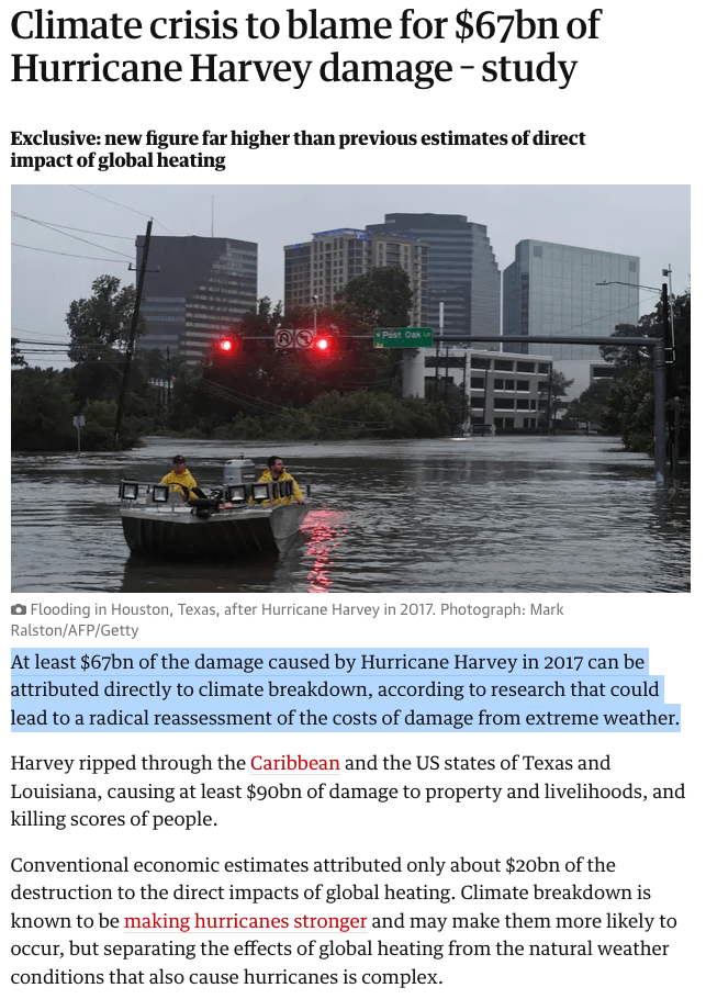
Notably, it was used in an assessment of the economic impact of human influence on Hurricane Harvey (Frame et al., 2020). Specifically, Frame et al. (2020) state that estimated damages from Hurricane Harvey were $90 billion and that human influence on the climate was responsible for 75% of this $90 billion or ~$67 billion. They then use this number to argue that traditional estimates of the costs of climate change that inform the social cost of carbon estimates are drastically underestimated, as the authors’ post on Carbon Brief communicates:
Cost of extreme weather due to climate change is severely underestimated.
This study received a great deal of attention. According to Altmetric, of over 20 million research outputs tracked, it was in the 99th percentile in terms of online attention. It was cited prominently (5 times) in the IPCC AR6 Working Group 2 Report. It was promoted on social media by high-profile climate communicators, endorsed by a climate scientist on Time Magazine’s 100 most influential people list, and made headlines in places like The Guardian.
Despite the attention and high-profile influence of this study and others like it, I believe it contains a fundamental flaw in reasoning that undermines its results.
The study makes use of the concept of the “Fraction of Attributable Risk (FAR)” which is a concept borrowed from epidemiology (Levin et al., 1953).
The idea is that you can quantify how a change in conditions affects the risk of some outcome. For example, it can quantify how exposure to a particular chemical affects the risk of contracting cancer over some period of time. The formula is,
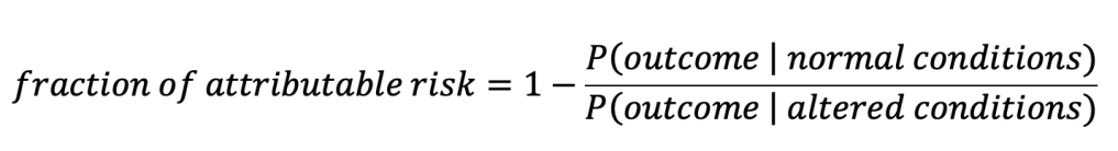
where P(outcome | normal conditions) should be read as “the probability of the outcome given normal conditions”. For the chemical-cancer example, the outcome would be the contraction of cancer, normal conditions would correspond to a group not exposed to the chemical and altered conditions would correspond to a group exposed to the chemical. Probabilities of cancer for the two groups could be estimated empirically by calculating the percentage in each group that was observed to contract cancer (Attributable fraction among the exposed).
If exposure to the chemical doubles the risk of cancer, and an exposed individual contracts cancer, then half of the risk of their contraction of cancer can be attributed to exposure to the chemical. If exposure to the chemical triples the risk of cancer then 2/3rds of their risk of cancer can be attributed to exposure and so on.
Now, we can further imagine that treatment of this cancer universally costs $20,000. If the fraction of attributable risk is 3/4ths or 75%, then a person exposed to the chemical with cancer can claim that
(0.75)x($20,000) = $15,000
of the expense of cancer treatment is due to that exposure.
This is the “attributable costs” method. Expressed as a formula it is:
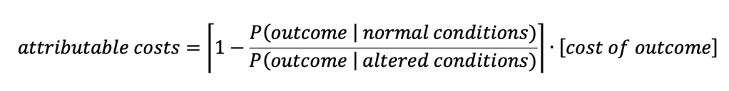
Implicit in the above formula is the notion that there is no cost if the outcome does not take place. In that sense, you could also think of the fraction of attributable risk as being multiplied by the difference between the cost with the outcome and the cost without the outcome where the cost without the outcome is zero.

The reasoning here makes sense because contracting cancer can more-or-less be considered a binary (either you contract it or you don’t). That means the $20,000 cost for treatment is also a binary (either $20,000 is paid for treatment or $0 for no treatment) and thus the ‘cost without outcome’ is zero and you can calculate the full financial impact by using the “attributable costs” method which simply multiplies the fraction of attributable risk by the expense of the outcome.
Analogously, the attributable costs of a weather event to human influence on the climate can be written as:
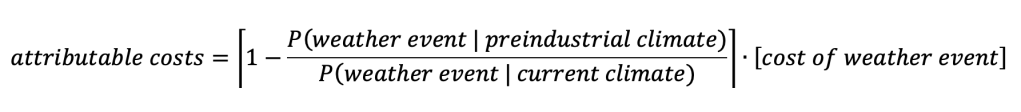
In Frame et al. (2020) they are interested in quantifying the economic damage from Hurricane Harvey that is due to human influence. But the first issue that arises is how to define the “weather event” they are studying.
The first idea that might come to mind might be that “landfalling tropical cyclones” constitute the event. Landfalling tropical cyclones are discrete phenomena that can be said to either occur or not and would thus more-or-less fit into this framework. However, many estimates of changes in tropical cyclone activity actually project a decrease in total tropical cyclone number under climate change. This would yield a negative attributable cost. However, the researchers of Hurricane Harvey weren’t necessarily interested in changes in the odds of all landfalling tropical cyclones but rather changes in the odds of tropical cyclones very much like Hurricane Harvey. Harvey was notable, in particular, because of its extreme rainfall and there is robust evidence that the most extreme rainfall should be enhanced as the world warms.
Thus, Frame et al. (2020) define the “weather event” using rainfall totals that breach the threshold of being as high or higher than what was seen during Hurricane Harvey.
Unlike landfalling tropical cyclones, however, rainfall totals are not really discrete phenomena that you can count in the same way. It’s more natural to think of rainfall totals as coming from a continuous probability distribution of possible rainfall totals.
This move from a discrete weather event, to defining an “event” by choosing a threshold from a continuum renders the “attributable costs” method invalid. When we unpack the logic into steps we can see where it breaks down:
- Hurricane Harvey caused $90 billion in damage
- The definition of the “event” representing Harvey is rainfall at or above the amount seen during Harvey
- Human influence on the climate is responsible for 75% of the risk of the “event”, so defined.
- Thus, human influence on the climate is responsible for 75% of $90 billion of damage, or $67 billion.
The above reasoning smuggles in the idea from the epidemiological example that the “event” is dichotomous: either it occurs or it does not and thus the $90 billion in damage either occurs or it does not. The reasoning requires that the ‘cost without the outcome’ is zero.
The costs from cancer only activate if you contract cancer. There are no costs for cancer if you don’t contract cancer. But the costs from rainfall begin to accumulate long before the event threshold is reached. There are costs from rainfall even when there is no ‘event’, so defined.
One could argue that the cost without the outcome would be zero if the ‘event’ was landfalling tropical cyclones (if there is no landfalling tropical cyclone then there is no damage from a landfalling tropical cyclone) but one cannot claim this for rainfall beyond a threshold. Imagine 1/100th of an inch less rain fell during Harvey. Would the $90 billion in damage disappear? Of course not. All of the rain from Harvey, including that last 1/100th of an inch, is required for the 75% ‘fraction of attributable risk’ to be valid but not all of the rain is required for there to be any damage at all.
In summary, the authors of Frame et al. (2020) are implicitly attributing all $90 billion in damages to the very last 1/100th of an inch of rainfall which is what allowed the arbitrary threshold to be crossed and ‘eventhood’ to be achieved. This flawed reasoning also applies to the original 2003 Nature commentary which used flooding as the example.
Changes in the Magnitude of an Event
A much clearer framing of the question is obtained when human influence on changes in the magnitude of some aspect of the weather are focused on rather than the frequency of crossing an arbitrary threshold (I have discussed the relationship between these previously Brown, 2016). Some of the studies referenced in Frame et al. (2020) also estimate the human influence on the magnitude of rainfall during Harvey and they come up with the following figures:
“Human-induced climate change likely increased Hurricane Harvey’s total rainfall by at least 19%” (Risser and Wehner at al., 2017)
“We conclude that global warming made the precipitation about 15% (8%–19%) more intense” (van Oldenborgh et al., 2017)
Immediately these numbers should give one pause when they are compared to the 75% estimate from Frame et al. (2020). Does the paper claim that 75% of the damage from Harvey came from the additional 15% to 19% of precipitation? That would be theoretically possible if the additional 15%-19% of rain caused some physically meaningful threshold to be breached (like one corresponding to the height of a levee). However, the authors do not claim this and in fact, one of the authors calculates in a more recent study that the 20% increase in rain results in only a 15% increase in flood area (Wehner and Sampson, 2021).
Looking at the human influence on the magnitude rather than on the frequency of crossing an arbitrary threshold, yields an estimate of the damages from human influence of $13 billion (Wehner and Sampson, 2021). Taken at face value, this would indicate that the logical flaw in the “attributable costs” method led to an overestimation of the damages from Harvey by a factor of about 5.
However, I contend that even this type of calculation is misleading if one wishes to get a holistic sense of the economic impact of climate change in any given year. Frame et al. (2020) are indeed interested in this: in both the paper itself and in their CarbonBrief article they compare their damage estimate from Harvey to those from Integrated Assessment Models (IAMs) which correspond to mean damages for any given year. They argue that IAM-based damages must be huge underestimates because they only calculate annual mean costs of ~$20 billion per year in the US while their study attributes $67 billion to human influence for a single event (Harvey).
I argue that this too is a deeply flawed comparison because the rarity of an event like Hurricane Harvey would have to be taken into account to compare it to an annual mean estimate of damages from human influence on the climate. I illustrate what I believe is a better way to get a full sense of the human influence on economic damages below.
Expected Damages with and without Human Influence
Figure 1 illustrates a more complete way of estimating the economic damages from rainfall in Houston with and without climate change. This is intended to be an illustrative exercise and none of the exact numbers should be taken too seriously.
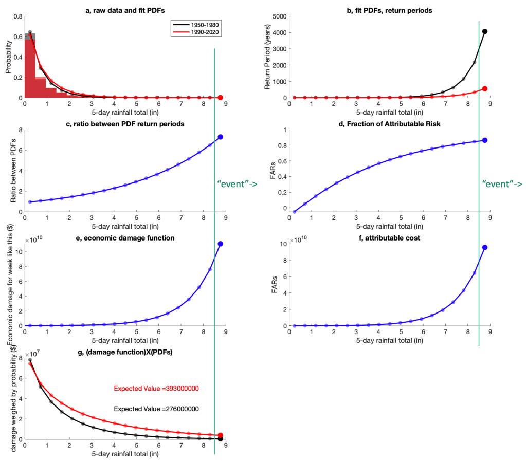
Figure 1a shows histograms of 5-day rainfall totals for the 30 year period from 1950 to 1980 (grey) and for the 30 year period from 1990 to 2020 (red) averaged over the broader Houston area. Superimposed are gamma distributions fit to the raw data. Gamma distributions are often used to model rainfall (Wilks, 2011) and although the fit is imperfect, these distributions exemplify the most relevant properties of how rainfall probabilities are thought to shift under warming. In particular, the distribution shifts in the most recent period such that the probability of low rainfall weeks is decreased and the probability of high rainfall weeks is increased (c.f., red and black in Figure 1a and 1b). Return periods and shifts in return periods of the most extreme events are also roughly in line with those calculated from more sophisticated methods.
In this example, the most extreme rainfall bin (above ~8.5 inches) shifts its probability from a once-in-4,300 year event in the 1950 to 1980 period to a once-in-600 year event in the 1990 to 2020 period (Figure 1b). Consistent with more comprehensive studies and basic theory, the more extreme the rainfall, the more the probability shifts between the two distributions. Figure 1c shows the ratio between the probabilities (or equivalently, return periods) between the two distributions, and Figure 1d shows the fraction of attributable risk to human influence on the climate (assuming that 100% of the shift in the rainfall distribution can be attributed to human influence).
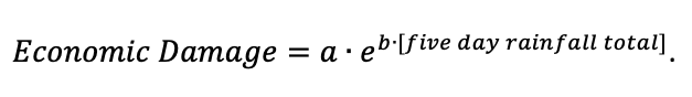
Now let’s suppose a “damage function” that estimates the economic damage as a function of rainfall totals. Small rainfall totals cause almost no damage but the largest rainfall totals can cause damage close to 100 billion (as seen in Harvey). A function that mimics this behavior (shown in Figure 1e) is the exponential function with a=1×10⁸ and b=0.8,
Multiplying the economic damage function by the ‘fraction of attributable risk’ gives us the “attributable cost” function (Figure 1f) which emphasizes how extreme the costs attributable to human influence get using this method: If we define an event to be an occurrence of the most extreme rainfall (thick circles in all plots), and that event occurs, then the costs attributable to human influence would be calculated to approach $100 billion.
However, as noted above, even in the most recent time period, this most extreme rainfall total is still a once-in-600 year event. Thus, if you want to estimate the annual average damage from this level of rainfall, you’d have to divide it by 600 to account for its rarity.
Thus, damages estimated from this single event (even if they are magnitude-based rather than frequency-based) could be off by two to three orders if they are interpreted as corresponding to an annual mean value.
More formally, the holistic way to compare the two climate states is to take the difference of the expected values of the damages between the current climate and the preindustrial climate. In doing this, the economic damage function is weighted by the corresponding probabilities and then summed across all values.
Figure 1g shows that as rainfall becomes more extreme, the rarity of the event reduces its impact on the expected value. We see a change in expected value from $276 million per year in the 30 year period from 1950 to 1980 to $393 million per year in the 30 year period from 1990 to 2100 or a total difference of $117 million per year attributable to climate change.
The IAM figure that Frame et al. (2020) claim must be a huge underestimate was $20 billion annual damage in the US from climate change. Comparing $117 million per year to $20 billion per year, is it possible that 0.6% of total us climate damages attributable to human activity comes from rainfall shifts in one of the largest metro areas on the gulf coast? I don’t know, but that calculation does not obviously invalidate the IAM estimate as Frame et al. (2020) claim to do.
I should note that the more the damage function is magnified at higher rainfall totals, the more the ‘attributable cost’ method will overestimate the costs from climate change relative to the more holistic ‘expected value’ method. Thus, a lot of effort should be placed on defining this damage function.
In conclusion, the ‘attributable cost’ method is not appropriate to apply when the ‘event’ must be defined with an arbitrary threshold on a variable that imposes costs on a continuum (rather than flipping costs on or off). It should only be applied if the ‘event’ is a real physical phenomenon that can be said to either ‘occur or not’ or if the threshold is physically meaningful (i.e., enough rain to overwhelm a levee). Applying the attributable costs method likely overestimated the economic damages from Harvey by a factor of about 5 (if the estimates of Wehner, M., Sampson, C. (2021) are taken at face value). Furthermore, if one wishes to compare the numbers produced from these types of analyses to existing annual mean damage estimates (e.g., from IAMs), the damages from extremes have to be weighed by their low probability of occurrence in any given year. In this case, not doing so could cause an overestimate of the annual mean costs of human influence on the climate by two to three orders of magnitude.
This is a very important topic and it’s crucial that the methods used to address it are as accurate as possible. I hope this post serves as constructive criticism and possibly helps inform future research in this area.
Appendix
Since writing this, I see that several of the authors of the Frame et al. (2020) study have published a paper (Perkins et al., 2022) walking back some of their claims and/or urging caution in interpreting the results of the ‘attributable cost’ method. It looks like the authors of this study would agree with several of the points I have raised here. However, I don’t see an explicit repudiation of the reported results of Frame et al. (2020) or any effort to correct any media coverage of the results.
References
Allen M (2003) Liability for climate change. Nature 421:891–892
Brown, P. T. (2016) Reporting on global warming: A study in headlines, Physics Today, doi:10.1063/PT.3.3310
Frame, D.J., Wehner, M.F., Noy, I. et al. (2020) The economic costs of Hurricane Harvey attributable to climate change. Climatic Change 160, 271–281. https://doi.org/10.1007/s10584-020-02692-8
Levin, M. (1953) The occurrence of lung cancer in man. Acta Unio Int. Contra Cancrum., 9, 531–541.
Perkins-Kirkpatrick, S. E. et al. (2022) Environ. Res. Lett. 17 024009. https://doi.org/10.1088/1748-9326/ac44c8
Risser, M. D., & Wehner, M. F. (2017). Attributable human-induced changes in the likelihood and magnitude of the observed extreme precipitation during Hurricane Harvey. Geophysical Research Letters, 44, 12,457–12,464. https://doi.org/10.1002/2017GL075888
Oldenborgh GJV, Wiel KVD, Sebastian A, Singh R, Arrighi J, Otto F, Haustein K, Li S, Vecchi G, Cullen H (2017) Attribution of extreme rainfall from Hurricane Harvey, august 2017. Environ Res Lett 12:124009
Wehner, M., Sampson, C. (2021) Attributable human-induced changes in the magnitude of flooding in the Houston, Texas region during Hurricane Harvey. Climatic Change 166, 20. https://doi.org/10.1007/s10584-021-03114-z
Wilks, D. (2011) Statistical Methods in the Atmospheric Sciences. 3rd addition, Elsevier.
Meteorology and Climatology of Wind and Solar Droughts
We have a paper out on a field of increasing importance in meteorology: The analysis of synoptic-scale extreme reductions in wind and solar power energy resources (i.e., wind and solar “droughts”).
If you like talks more than papers here is a talk I gave to Woods Hole Oceanographic Institution on the research.
More details are below but first, some background: Two broad trends make it so that our society’s energy consumption is being impacted progressively more by the weather: 1) Increasingly more and more of society’s energy consumption is coming via electricity (e.g., the electrification of transportation and water/space heating). 2) Increasingly more and more of that electricity is being generated from weather-dependent resources like wind and solar power.
Thus, as wind and solar power resources become more indispensable for society, a full scientific understanding of their droughts may approach the importance of understanding droughts in other resources like precipitation.
This concern has inspired a lot of work on the general topic of the (co)variability of wind and solar power resources but less work has been done on the atmospheric circulation patterns responsible for generating synoptic-scale reductions in wind and solar power resources, both independent of each other and in conjunction.
These extreme weather events have been occurring ‘under the radar’ since the dawn of meteorology but they have not received significant scientific attention because of their historical lack of impact. However, this situation is now rapidly changing as market forces and legal mandates increase the penetration of wind and solar power generation in electricity grids around the world.
This is exemplified in the recent situation in Europe where electricity prices spiked in part because of reduced wind power supply.

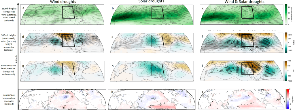
In our study, we focus on the meteorological causes of these extreme events over a case study region of western North America with an emphasis on synoptic-scale atmospheric circulations.
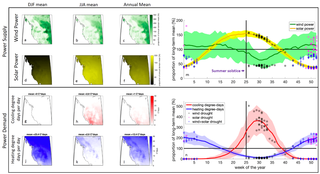
We found that perhaps not surprisingly, wind droughts are typically associated with high-pressure systems and solar droughts are typically associated with low-pressure systems and thus wind and solar resources should be anti-correlated at synoptic weather scales.
This along with the fact that wind and solar resources are anticorrelated at the seasonal timescale supports the notion that including both wind and solar power in an energy resource portfolio reduces risk in the same way that diversifying a stock portfolio does.
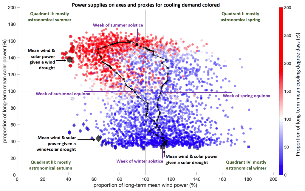
More specifically, wind drought events over the western US were associated with a thermal mid-level ridge (warm-core high) centered over British Columbia & solar drought events were associated with a thermal mid-level trough (cold core low) off of the west coast of North America.


Furthermore, we found that the synoptic-dynamic meteorology of these phenomena was interpretable through classic Quasi-Geostrophic Theory. This is evidence that these droughts are manifestations of well-known and well-understood weather patterns and are not the result of some unexpected or exotic mechanism. That hopefully means that wind and solar droughts should be as forecastable as any synoptic weather phenomena on daily to seasonal timescales and it suggests that they should be represented reasonably well by courser resolution climate models.
We also find some indication that both wind droughts and solar droughts are slightly associated with positive El Niño and/or positive PDO situations, especially in their most extreme manifestations (Supp Fig. 17 j,k,l).
Finally, this research also supports the notion that there is value in pooling renewable energy resources over areas large enough to encompass the full wavelength of typical Rossby Waves which implies that, in the US, there are significant benefits in moving towards a continental scale “super grid” connected by high voltage transmission.
For more on this research topic see here: https://weatherclimatehumansystems.org/research If you are interested in collaborating on research along these lines please feel free to contact me!
Posted in Uncategorized
1 Comment
Claims in “How Climate Migration Will Reshape America” vs. observational data
A few people asked me about the accuracy of a recent NY Times Magazine / NY Times Daily Podcast story “How Climate Migration Will Reshape America”. It contains plenty of interesting discussion on e.g., property insurance under a changing climate but it is very loose with the facts on current climate change in the US and it continuously errs on the side of hyperbole and exaggeration.
Below I take a look at observational data corresponding to some of the claims in the article. Overall, I think the data gives a very different impression of the state of climate change in the US than does the rhetoric in the piece.
This is important because this kind of exaggeration undermines the credibility of the NY Times / NY Times Daily Podcast at a time when people really need journalism they can trust.
Furthermore, the issue of human migration under climate change is important and thus it needs to be covered in a serious and fact-based way. We cannot afford for this kind of sloppiness to give people an excuse to dismiss the entire premise.
Most of this piece’s claims are about the future. It is difficult to fact-check claims about the future so I will just look at a few claims that can be easily put in context against historical observational data.
Claim: “August besieged California with a heat unseen in generations.”
Context on CA heat: August 2020 was the fourth hottest month on record in California. It’s average temperature was 79°F. Not as hot as July 2018 (79.6°F), July 2006 (79.3°F), or July 1931 (79.5°F). So it was hot but not “unseen in generations”.

Claim: “I am far from the only American facing such questions. This summer has seen more fires, more heat, more storms — all of it making life increasingly untenable in larger areas of the nation”
Context on fires: The nation has not seen more fires through August but when September numbers are tallied this will indeed go up and likely will set a record. Though it is important to note that there is not an obvious nationwide long-term trend in wildfires.
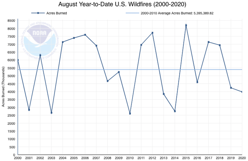
More context on fires: It is perhaps worth mentioning that global annual area-burned has decreased over the past 20 years. This illustrates that, thus far, climate is not a first-order influence on area-burned and its influence can be totally overwhelmed by other factors. https://www.weatherclimatehumansystems.org/faq-on-fires-humans-and-global-change
Context on US heat: It is true that this summer was hot in the US. It was the 4th warmest on record behind 2011, 2012 and 1936.

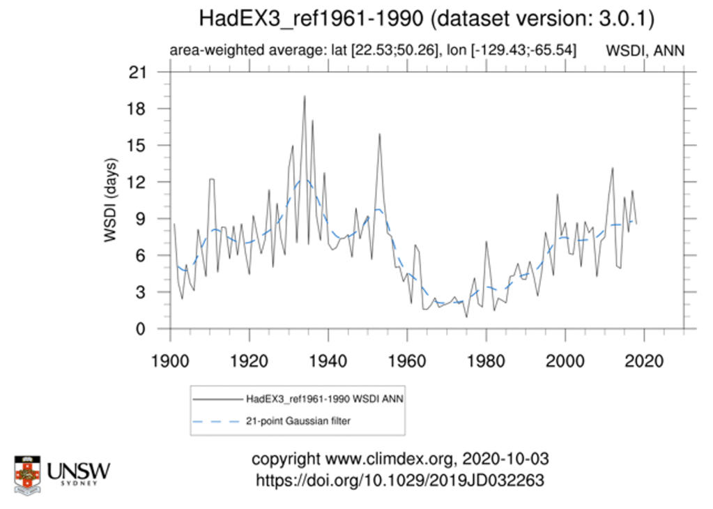
More context on heat: Rather than looking at summer means, we can look at indices that measure attributes of heatwaves like the “Warm Spell Duration Index”. Here’s what that looks like for the US. The 1920s and 1930s had higher values that what we have seen recently.
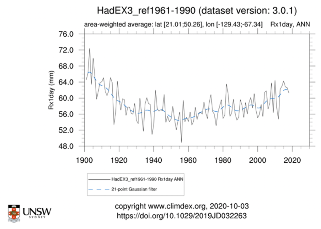
Context on storms: It is not clear what is meant by storms. But maximum 1-day precipitation might be a pretty good proxy for what most people think of as storms. There have been increases in this metric over recent decades but we are not at a historical maxima:
More context on storms: The author could also be referring to tropical storms. Below is a measure of tropical storms making landfall in the United States. We can see some increase in recent decades.

Claim: “Already, droughts regularly threaten food crops across the West…”
Context on droughts: The brown bars are the area in the US that are much more arid than normal. The US West has indeed seen bad droughts in the 2000s and 2010s. More on crops below.
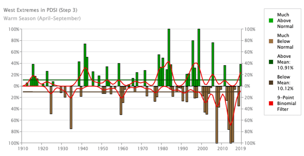
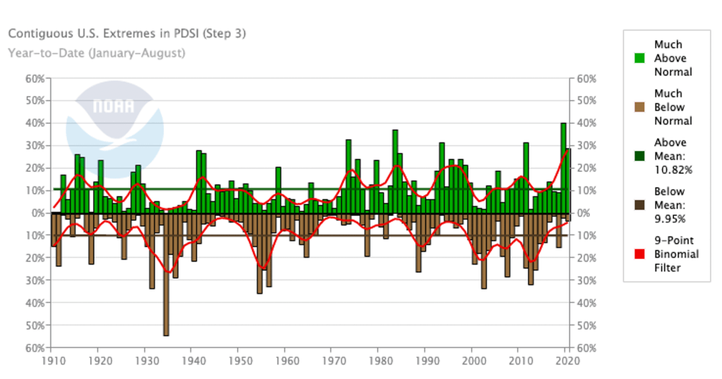
More context on droughts: It is worth noting that we do not see long-term trends in droughts over the US overall.
Claim: “while destructive floods inundate towns and fields from the Dakotas to Maryland”
Context on floods: Here is the long-term change in an index of maximum 5-day precipitation. While not a direct measure of floods, this can be thought of as a rough proxy. By this measure, we are not currently at a historical maxima.

Claim: “Rising seas and increasingly violent hurricanes are making thousands of miles of American shoreline nearly uninhabitable.”
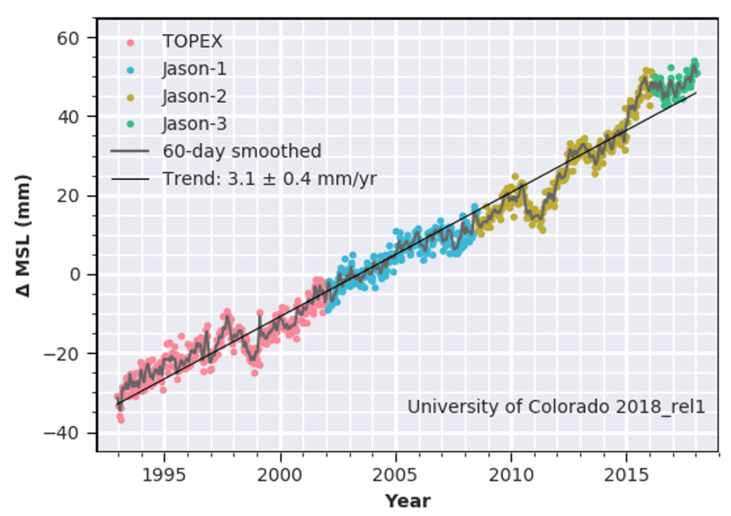
Context on rising seas: Global sea levels have risen about 3 inches since the mid 1990s. This will be a major problem as it continues but does 3 inches plus the change in tropical cyclones shown above amount to “thousands of miles of shoreline nearly uninhabitable”? Sorry, it does not.
Claim: “Let’s start with some basics. Across the country, it’s going to get hot. Buffalo may feel in a few decades like Tempe, Ariz., does today”
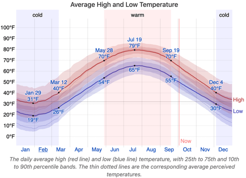
Context: This is absolutely false. The average daily high temperature in July in Buffalo NY is near 79°F. The average daily high temperature in July in Tempe Arizona is near 106°F. That’s a 27°F difference.
Buffalo is projected to warm by roughly 2.3°F under a medium emissions scenario by 2050 (and by 5°F by 2100). So that would mean that the author claimed a warming of something like 27°F “in a few decades” when our best estimate is something closer to 10% of that.
Claim: “The Great Plains states today provide nearly half of the nation’s wheat, sorghum and cattle and much of its corn; the farmers and ranchers there export that food to Africa, South America and Asia. Crop yields, though, will drop sharply with every degree of warming.”
Context on crop yields: Historically it has warmed and crop yields have only increased. For one thing, there has been little detrimental climate stress on US crops so far, as measured by indices like the Crop Moisture Stress Index:
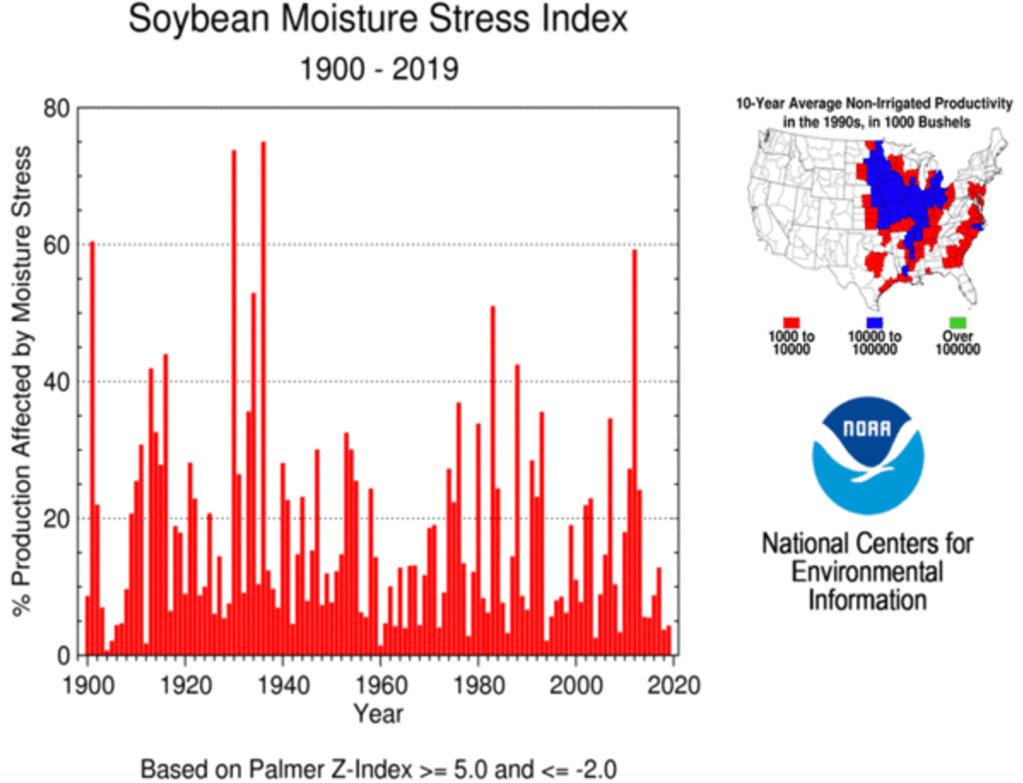
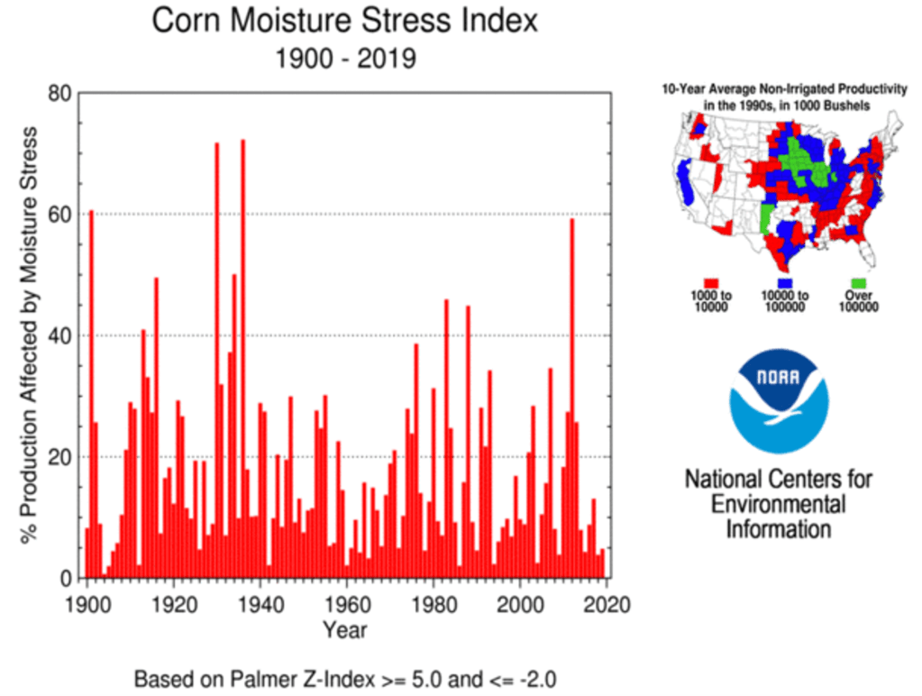
Further Context on crop yields: Yields of corn and other crops have only increased globally because changes in technology and agricultural practices have vastly outweighed any negative impact from climate. https://ourworldindata.org/crop-yields

Claim: “It was the kind of thing that might never have been possible if California’s autumn winds weren’t getting fiercer and drier every year”.
Context on CA autumn winds: The most infamous fire-enhancing autumn winds in CA are the “Santa Ana winds”. They are not increasing every year and projections suggest that their occurrence will be less frequent not more frequent under climate change.
https://agupubs.onlinelibrary.wiley.com/doi/abs/10.1029/2018GL080261
Claim: “The 2018 National Climate Assessment also warns that the U.S. economy overall could contract by 10 percent.”
Context: This is a 10% contraction relative to a no-climate change scenario not 10% contraction relative to today. That distinction makes a huge difference. It means that the projection says that if GDP were to increase by 100% without climate change over the next 80 years (very conservative estimate) then climate change would cause GDP to “only” increase by 90%.
Claim: “Once you accept that climate change is fast making large parts of the United States nearly uninhabitable…”
Context: I am sorry but this is just not reconcilable with the data above.
I could go on with other claims made in this piece but I’ll stop here for now. You should get the idea. It paints a picture of current climate change in the US that is very different than the story that is told from looking at the actual observational data and all the errors are in the direction of overstating the negative impact on the US today.
The editors at NY Times Magazine / The Daily Podcast must think that being cavalier with the facts is OK because ‘sending the right message’ on climate change is more important than accuracy. I could not disagree more.
At a time when trust in institutions like the New York Times is faltering, and the right calls them fake news – they cannot afford to confirm that narrative. It makes it too easy for those who want to be dismissive of climate change to feel vindicated in that belief.
Plots above are mostly from: https://ncdc.noaa.gov/cag/ and https://climdex.org/access/
Posted in Uncategorized
2 Comments
Tipping Points in the Climate System
Lecture on tipping points in the climate system from my frosh, general education level Global Warming course.
Posted in Uncategorized
2 Comments
