
The text below is an extended version of a peer-reviewed article that appeared in Physics Today:
- Brown, P. T. (2016) Reporting on global warming: A study in headlines, Physics Today, doi:10.1063/PT.3.3310
It is well established that human-caused increases in greenhouse gasses are working to increase the average surface temperature of the planet on long timescales1. This fact, however, means very little in terms of the consequences that climate change might have on human society. People are affected far more by local weather extremes than by any change in global average temperature. Therefore, the connection between extreme weather events (like floods, droughts, hurricanes, tornadoes, heat waves, etc.) and global warming, has been of great interest to both scientists and the general public.
Any effect that global warming might have on extreme weather, however, is often difficult to ascertain. This is because extreme weather events tend to be influenced by a myriad of factors in addition to the average surface temperature. Hurricanes, for example, should tend to increase in strength as seas become warmer2 but we also expect that changes in wind shear3 (the change in wind direction with height) should cause a reduction in hurricane frequency4.
There are similar countering factors that must be weighed when assessing global warming’s impact on floods, droughts, and tornadoes. One type of extreme weather event, however, can be connected to global warming in a relatively straightforward manner: heat waves. Increasing greenhouse gasses have a direct effect on the probability distribution of surface temperatures at any given location. This means that when a heat wave occurs, it is safe to assume that global warming did have some impact on the event. How much of an impact, however, depends largely on how you frame the question.
Let’s say that you live in a location that happens to experience a particular month when temperatures were far above average. Lets further imagine that three scientists assess the contribution from global warming and their findings are reported in three news stories that use the following headlines:
Headline A: Scientist finds that global warming increased the odds of the recent heat wave by only 0.25%.
Headline B: Scientist finds that recent heat wave was due 71% to natural variability and due 29% to global warming.
Headline C: Scientist finds that global warming has made heat waves like the recent one occur 23 times more often than they would have otherwise.
These three headlines seem to be incompatible and one might think that the three scientists fundamentally disagree on global warming’s role in the heat have. After all, Headline A makes it sound like global warming played a minuscule role, Headline B make it sound like global warming played a minor but appreciable role, and ‘Headline C’ makes it sound like global warming played an enormous role.
Perhaps surprisingly, these headlines are not mutually exclusive and they could all be technically correct in describing a particular heat wave. This article explores how these different sounding conclusions can be drawn from looking at the same data and asking slightly different questions.
The actual numbers for the headlines above correspond to a real event: The monthly average temperature of March 2012 in Durham, North Carolina5. I selected Durham for this example simply because it is a place I have lived, and March 2012 was selected because, at the time of the writing, it was the warmest month (relative to the average temperature for each month of the year) that Durham had experienced over the past several decades. Now let’s look at the specifics of how each headline was calculated.
Headline B: Calculating global warming’s contribution to the magnitude of the heat wave.
I will begin by explaining Headline B since it is probably the most straightforward calculation of the three. The left panel of the figure below shows the monthly “temperature anomaly” for Durham from 1900 to 20136. The temperature anomaly is the difference between the observed temperature for each month and the long-term average for that month of the year. So a temperature anomaly of +3°C would mean that month was 3°C above average. I use temperature anomalies because heat waves are defined as periods of time when temperatures are unusually warm relative to the average for that location and time of year.
The red line in the left panel below is an estimate of long-term global warming in Durham7 which is calculated from physics-based numerical climate models8. The red line incorporates natural influences like changes in solar output and volcanic activity but virtually all of the long-term warming is attributable to human-caused increases in greenhouse gasses. When I use the term global warming in this article I am specifically referring to the long-term upward trajectory of the “baseline climate” illustrated by the red line in the left panel.
So what would the temperature in Durham have looked like if there had been no global warming? We can calculate this by subtracting the estimate of global warming (red line) from each month’s temperature anomaly (black line). The result is shown in the right panel below. Notice how the right panel’s “baseline climate” is flat; indicating that there was no underlying climate change in this hypothetical scenario and all temperature variability came from natural fluctuations9. We can see that March 2012 would still have been a hot month even without global warming but that it would not have been as hot.
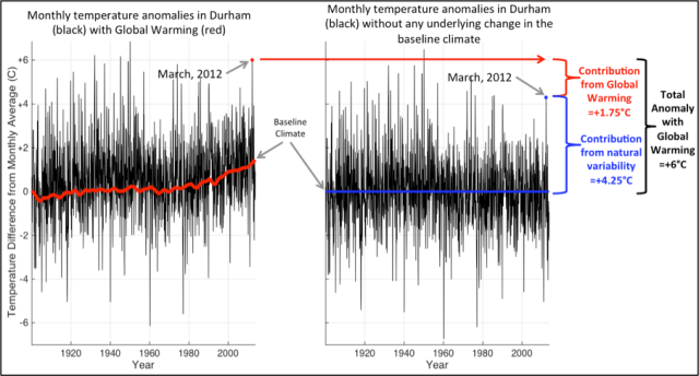
In fact, we can now see how headline B was calculated. If the total anomaly with global warming in March 2012 was +6°C and the contribution from natural variability was +4.25°C, then global warming contributed +1.75°C of the +6°C anomaly. To put it another way, the global warming contribution to the magnitude of the heat wave was 29% (1.75°C/6°C = 0.29) while the natural variability contribution to the magnitude of the heat wave was 71% (4.25°C/6°C = 0.71). It is interesting to notice that if March 2012 had been even hotter, then the contribution from global warming would actually have been less. Why? Because the contribution from global warming would have been the same (the red line would not change) so it would have been necessary for natural variability to have contributed even more to the magnitude of a hotter anomaly. For example, if March 2012 had been 8°C above average, then global warming would still have contributed 1.75°C which means global warming would only have contributed 1.75°C/8°C = 0.22 or 22% of the magnitude.
Headline B quantifies how much global warming contributed to the magnitude of the heat wave (how hot the heat wave was), but lets now turn our attention to how much global warming contributed to the likelihood that the heat wave would have occurred in the first place.
Headline A and C: Calculating global warming’s influence on the change in the likelihood of the heat wave.
The conclusions of Headlines A and C sound the most different but arriving at these numbers actually requires very similar calculations. To make these types of calculations it is often assumed that, in the absence of global warming, temperature anomalies follow some kind of a probability distribution. Because it is the most familiar, I will use the example of the normal distribution (a.k.a. Gaussian or bell-curve distribution) below10.
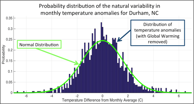
The next step is to notice how global warming has shifted the probability distribution over time11 (top panel below). This shows us how the +1.75°C change in the baseline temperature due to global warming has affected the probability of observing different temperature anomalies. Actually, we can now see how Headline A was calculated. Without global warming, an anomaly of +6°C or warmer was very unlikely – its chance of occurring in any given month was about 0.0117%. Even if we consider that global warming shifted the mean of the distribution by +1.75°C, an anomaly of +6°C or greater was still very unlikely – its chance of occurring in any given month was about 0.26%. So global warming increased the chance of the March 2012 Durham heat wave by 0.26% – 0.0117% = ~0.25%.
That doesn’t sound like a big change, however, this small shift in absolute probability translates into a big change in the expected frequency (how often such a heat wave should occur on average). The usual way to think about the expected frequency is to use the Return Time12 which is the average time that you would have to wait in order to observe an extreme at or above a certain level. The middle panel below shows the Return Times for Durham temperature anomalies both with and without global warming.
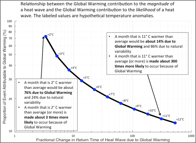
A probability of 0.0117% for a +6°C anomaly indicates that without global warming this would have been a once-in-a-8,547-month event (because 1/0.000117 = 8,547). However, a probability 0.26% for a +6°C anomaly indicates that with global warming this should be a once-in-a-379-month event (because 1/0.0026 = 379). Now we can see where Headline C came from: global warming made the expected frequency 23 times larger (because 8,547/379 = 23) so we expect to see a heat wave of this magnitude (or warmer) 23 times more often because of global warming.

In fact, from the bottom panel above we can see that the more extreme the heat wave, the more global warming will have increased it’s likelihood. This may seem counterintuitive because we have already seen that the greater the temperature anomaly, the less global warming contributed to its magnitude. This seemingly paradoxical result is illustrated in the Figure below. Essentially, it takes a large contribution from natural variability to get a very hot heat wave. However, the hotter the heat wave, the more global warming will have increased its likelihood.
So which of the three headlines is correct?
All the headlines are technically justifiable; they are simply answering different questions. Headline A answers the question: “How much did global warming change the absolute probability of a +6°C (or warmer) heat wave?” Headline B answers the question: “What proportion of the +6°C anomaly itself is due to global warming?” And Headline C answers the question: How much did global warming change the expected frequency of a +6°C (or warmer) heat wave?
In my judgment, only Headline A is fundamentally misleading. Since extremes have small probabilities by definition, a large relative change in the probability of an extreme will seem small when it is expressed in terms of the absolute change in probability. Headline B and Headline C, on the other hand, quantify different pieces of information that can both be valuable when thinking about global warming’s role in a heat wave.
Footnotes
- The most comprehensive scientific evaluation of this statement is presented in the IPCC’s 2013, Working Group I, Chapter 10.
- Emanuel, K. 2005. Increasing destructiveness of tropical cyclones over the past 30 years, Nature, 436, 686-688.
- Vecchi, G. A., B. J. Soden. 2007. Increased tropical Atlantic wind shear in model projections of global warming, Res. Lett., 34, L08702, doi:10.1029/2006GL028905.
- Knutson, T. R., J. R. Sirutis, S. T. Garner, G. A. Vecchi, I. M. Held. 2008. Simulated reduction in Atlantic hurricane frequency under twenty-first-century warming conditions, Nature Geoscience, 1 359-364 doi:10.1038/ngeo202.
- Data from the Berkeley Earth Surface Temperature Dataset
- The temperature data used here are in degrees Celsius (°C). °C are 1.8 times larger than °F so a temperature anomaly of 6°C would be 1.8×6 = 10.8°F.
- The global warming signal is more technically referred to as the “externally forced component of temperature change”. This is the portion of temperature change that is imposed on the ocean-atmosphere-land system from the outside and it includes contributions from anthropogenic increases in greenhouse gasses, aerosols, and land-use change as well as changes in solar radiation and volcanic aerosols.
- Climate model output is the multi-model mean for Durham, NC from 27 models that participated in the CMIP5 Historical Experiment
- The technical terms for this type of variability are “unforced” or “internal” variability. This is the type of variability that spontaneously emerges from complex interactions between ocean, atmosphere and land surface and requires no explicit external cause.
- There is precedent for thinking of surface temperature anomalies as being normally distributed (e.g., Hansen et al., 2012). However, it should be noted that the specific quantitative results, though not the qualitative point, of this article are sensitive to the type of distribution assumed. In particular a more thorough analysis would pay close attention to the kurtosis of the distribution (i.e., the ‘fatness’ of the distribution’s tails) and would perhaps model it through a Generalized Pareto Distribution as is done in Otto et al., 2012 for example. Also, instead of fitting a predefined probability distribution to the data many stochastic simulations of temperature anomalies from a noise time series model or a physics-based climate model could be used to assess the likelihood of an extreme event Otto et al., 2012.
- Hansen, J., M. Sato., R. Ruedy, 2012, Perception of climate change, PNAS, vol. 109 no. 37 doi: 10.1073/pnas.1205276109.
- Otto, F. E. L., Massey, G. J. vanOldenborgh, R. G. Jones, and M. R. Allen, 2012, Reconciling two approaches to attribution of the 2010 Russian heat wave, Geophys. Res. Lett., 39, L04702, doi:10.1029/2011GL050422.
- For simplicity I assume that the variance of the distribution does not change over time and that global warming has only shifted the mean of the distribution.
- Return Times were calculated as the inverse of the Survival Function for each of the distributions.

Thanks for the great article. Question: it says:
“For simplicity I assume that the variance of the distribution does not change over time and that global warming has only shifted the mean of the distribution.”
_Does_ global climate change increase the variance? And if so, has anyone evaluated how this would affect the frequency of extreme weather events?
Pingback: Overestimating the Human Influence on the Economic Costs of Extreme Weather Events | Patrick T. Brown, PhD