
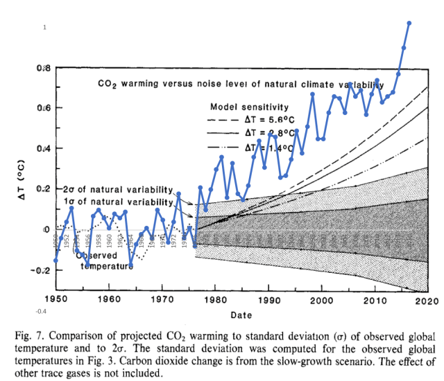
It is always useful to check past predictions against eventual observations. Below is the NASA GISTEMP observed global temperature (updated through 2016) overlain on top of various projections of CO2-induced warming from calculations published in 1981 (Hansen et al. 1981). 2015 and 2016 are literally off of the chart. This does not imply higher equilibrium climate sensitivity than that represented by the dashed line (5.6C) because these calculations did not include the effects of anthropogenic increases in non-CO2 greenhouse gasses. There are a number of other important caveats to this juxtaposition like Hansen’s model not allowing for unforced/internal variability as well as differences between the assumed and actual growth rate of atmospheric CO2 ect. Nevertheless, it is an interesting comparison.

Pingback: Orfani della Beall's list - Ocasapiens - Blog - Repubblica.it
For reference, the full paper of Hansen et al 1981 can be found here: http://www.atmos.washington.edu/~davidc/ATMS211/articles_optional/Hansen81_CO2_Impact.pdf
(The background image showing the prediction is figure 7.)
By the way, you attribute the fact that the measured warming is higher than the prediction to the fact that Hansen et al didn’t include gasses other than CO2. But the mismatch isn’t in the slope, it’s primarily an offset. There’s actually a simple explanation: Hansen et al’s predictions seem to be baselined to 1976 (presumably the last year for which they had data when they wrote the paper), and 1976 happened to be a cooler than average year, so the Hansen predictions started low by exactly that much. Draw a smooth curve through the measured temperatures, and start the Hansen et al prediction in 1976 on that curve, and the match is remarkably good.
Your comparison of data vs ECS values looks high to me.
Here is a plot of Gistemp, UAH satellite data and Maunal Loa CO2 data plus sunspot data:
http://woodfortrees.org/plot/gistemp/mean:12/plot/sidc-ssn/from:1880/normalise/mean:121/plot/esrl-co2/normalise/scale:1/offset:0.35/plot/uah5/mean:12/offset:0.43
A first order calculation of the ECS can be made for Gistemp data from 1958, when Muauna Loa data begins and for UAH from 1979 when satellite data begins.
By first order, i mean that the calculation ignores contributions to the observed temperature from forcings other than CO2. These are most likely to be net cooling contributions, given the reduction in solar activity as measured by sunspot numbers, and the increasing particulate pollution with industrialization of India and China in recent decades. the calculation does not take into account the time lag for the temperature to ‘catch up’ or equilibrate for a given CO2 concentration. For these reasons, the ECS calculated on the observed temperature is likely to be an underestimate.
Here is the calculation for Gistemp data. The temperature change is arrived at by the trend values given by Kevin Cowtan’s program:
https://www.skepticalscience.com/trend.php
Gistemp and Muana Loa data from 1958 to June 2017
Trend and 2 sigma confidence limits;
0.157 ±0.022 °C/decade giving a temperature increase for the entire 59.5 year period of
0.934± 0.131 (The error margin is 14%)
The rise in CO2 concentration rise in that time is from 315 to 405 ppm. (The error here is small and will be neglected)
The relationship is logarithmic, and is given by the following equation:
0.934 = k log(405/315) where k is the proportionality constant
k = 0.920/0.251 = 3.72
The temperature rise for a doubling of CO2 concentration is therefore
3.72 x log2 =
2.56 ± 0.36 °C
For UAH the ECS is calculated to be 2.3 ± 0.9 °C. The confidene limit is larger for satellite data beause it is more “noisy” than surface data (the variation of data points from the trend line is in average larger) and the trend period is shorter.
For the reasons given above this numbers are likely an underestimate, and the actual ECS is likely to be around 3 C.
This seems closer to the value apparent in an earlier comparison of Hansen’s model with data.
http://www.realclimate.org/index.php/archives/2012/04/evaluating-a-1981-temperature-projection/