
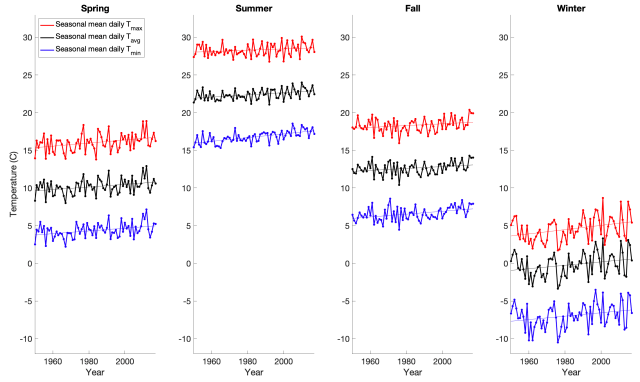
The graph above is a record of temperature from 1950-2017 for New York City.
What is unique about this graph is that it shows daily, seasonal, annual and decadal temperature variability on a single Y-axis, revealing how their magnitudes compare.
The daily temperature cycle is represented by the three colored lines in each panel, where red, black and blue represent the daily maximum, daily average and daily minimum for each season and year. For example, the red dots in the far left panel represent the average of all the daily maximum temperatures for the spring of each year.
We can see that in New York, the daily minimum temperature tends to be around 13 degrees C (23 degrees F) lower than the daily maximum temperature.
The annual temperature cycle is illustrated by the variation across the four panels with each panel representing one of the four canonical seasons.
We can see that in New York, the summer tends to be about 22 degrees C (40 degrees F) warmer than the winter.
Interannual temperature variability is illustrated by the year-to-year wiggles in each line.
We can see that in New York, there can be year-to-year swings in temperature (for a given season) of several degrees C. For example, the summer of 1999 had a daily average temperature of 24 C (75 F) and the summer of 2000 had a daily average temperature of 21 C (70 F). It is also notable that year-to-year variability in winter temperature is substantially larger than year-to-year variability in summer temperature.
Decadal temperature changes are represented by the linear trend lines. We can see long term warming which is primarily driven by increases in greenhouse gasses (i.e., this is the local manifestation of global warming). The long term warming is generally more prominent in the daily minimum temperature compared to the daily maximum temperature and more prominent in the winter compared to the summer. In other words, global warming is shrinking both the daily and seasonal temperature cycles.
In terms of absolute magnitude, the seasonal cycle is the dominant mode of variability, followed by the daily cycle, year-to-year variability and finally, long term warming.
Thus, while Global Warming is very pronounced on global spatial scales and centennial and greater timescales, we can see that, thus far, it has had a modest influence on the temperature in New York relative to the typical variability at the daily, seasonal and annual timescales.
Data here is from Berkeley Earth.

NYC has a much longer history of temperature measurements prior to 1950. Had you included those measurements your statement:
“We can see long term warming which is primarily driven by increases in greenhouse gasses (i.e., this is the local manifestation of global warming)”
would be unsupported and the rising temperatures since 1950 could equally well be accounted for as typical within a longer framework of natural variability.