
 Global average surface air temperature is one of the most well-recognized metrics of contemporary climate change – hence the term ‘global warming’. One reason for this is that many impacts of climate change are expected to be proportional to the amount of global average warming that occurs over the next several decades to centuries. This is why, for example, the Paris Accord explicitly states climate change mitigation goals in terms of global average temperature.
Projections of global temperature are often based on the output from physical global climate model simulations and thus there is great interest in the agreement (or lack thereof) between modeled and historically observed global temperature.
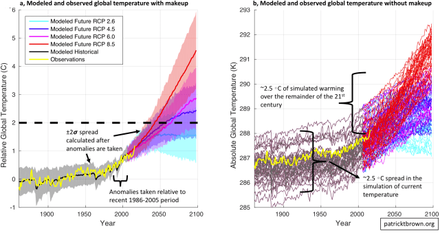
Official reports (like the IPCC report), tend to present the comparison of modeled and observed global temperature in a format like that shown in ‘panel a’ above. This plot shows the model-mean and the model-spread (+/- 2 standard deviations) of global average temperature since 1861 (black) compared to observations (yellow). Various possible future scenarios are also shown (red, magenta, blue, cyan) which differ due to different assumptions about how much greenhouse gasses humanity might emit.
In ‘panel a’ there appears to be quite a bit of agreement between modeled and observed global temperature from 1861 to the present and thus this seems to provide compelling visual support for climate models’ ability to simulate/project global average temperature in the future.
However, I think that it is important to point out that part of this visual support comes from some nontrivial ‘makeup’ being applied to the comparison. Firstly, these temperature time series are all expressed as anomalies relative to a 1986-2005 baseline period (and then re-zeroed to be relative to preindustrial temperatures). This has the visual effect of forcing the models to essentially agree with each other and to essentially agree with observations over this 1986-2005 time period. Secondly, the spread around the model-mean value is calculated after the anomalies are taken which has the visual effect of minimizing the range of modeled temperatures. Overall, this results in an impressively small model spread around observations over the historical record and a relatively constrained spread for each of the individual future projections.
The raw model output, without this ‘makeup’ applied, is shown in ‘panel b’ above. In ‘panel b’, the y-axis is the absolute value of simulated and observed global average temperature in Kelvin. It is still the case that observations are more-or-less in the middle of the model simulations, but it can now be seen that the range of simulated values for absolute global average temperature is pretty large (~2.5C). In fact, this range is approximately as large as the amount of warming that we might expect to see over the remainder of the 21st century.
Does this matter? from a visual perspective, ‘panel b’ seems to inspire less confidence in our projections of future warming than ‘panel a’ does. However, the relevant question is: do model biases in the absolute value of temperature have a strong relationship with potential model biases in the projection of temperature change?
It seems as though the magnitude of the model biases in global average temperature do have some relationship with the magnitude of modeled future warming. However, these biases do not matter so much that they would seriously undermine the model projections over the next century or so (see discussion around Fig. 9.42a In Ch9 of Working Group I in the 5th IPCC Report; and discussion around Fig. 2 and Appendix B in Hawkins and Sutton, 2016). Therefore, I think it is reasonable to compare modeled and observed temperature change the way it is done in ‘panel a’ as long as we don’t completely forget about ‘panel b’.

The temperature is going to go up over time. Looking at the graph of temperature over the last 600 million years, it shows a fairly constant 22°C with occasional dips for ice ages. Presently we are part way through the current ice age and temperature is around 14°C, so expect long term warming unless something catastrophic happens.
None of this ties warming to carbon dioxide (CO2). It’s hard to keep a straight face while arguing CO2 is causing warming since specific gravity of CO2 is 1.5189 which suggests it falls out of the sky instead of floating. Being 400 ppm give or take, it is a small amount and plants suck up what they can reach.
Thanks foor sharing this